
Quest for an Indiana Jones font
Sat, Jul 16, 2011
July has been a slow month for me so far, I blame that on Dragon Age II, which has consumed a great deal of my time over the last few weeks, but now that I have got that out of my system I can turn my attention back to some more interesting weekend projects.
I am still having fun remaking classic games in HTML5 like Pong and Breakout, and next on the list is a snakes-style game. There is nothing really complicated about the mechanics of a snakes game, so this time around I want to concentrate on the game polishing, the menu’s, animations and little effects that make a game feel finished.
Starting with a nice logo, maybe one that transitions in smoothly.
I knew I wanted an Indiana Jones style logo, since modern browsers can now show off custom web fonts, gradients and text shadows I assumed I could knock this up as a pure CSS heading…
…boy, was I wrong…
The Font
The folks at the ShyFonts Type Foundry have provided an Indiana Jones style font free for noncommercial use at dafont.com. It’s not entirely clear if it includes permission to use as a web font, but the shyfonts url (www.shyfonts.com) doesn’t seem to exist any more and the README doesn’t specify (understandable in 1999). I’m going to take a liberty and assume it’s ok for a personal snakes game project.
Using custom fonts in a web page can be done with the CSS3 @font-face feature, described here:
The biggest issue with the @font-face feature is the inconsistent support for different font formats across browsers. Paul Irish has the explanation, along with the solution:
The folks at fontsquirrel have built a tool that saves the rest of us the trouble of figuring any of this out. You simply upload one or more fonts and they will build you a package containing all the different formats required, along with the CSS needed to embed within your stylesheet:
I used the font squirrel generator on the sf-fedora fonts to generate all the formats I required, along with the CSS to include in my page:
@font-face {
  font-family: 'SFFedoraRegular';
  src: url('sf_fedora-webfont.eot');
  src: url('sf_fedora-webfont.eot?#iefix') format('embedded-opentype'),
       url('sf_fedora-webfont.woff') format('woff'),
       url('sf_fedora-webfont.ttf') format('truetype'),
       url('sf_fedora-webfont.svg#SFFedoraRegular') format('svg');
  font-weight: normal;
  font-style: normal;
}

// ...
Using CSS3
Having found our font. Lets start to use it in a heading
<h1 id="logo">Snakes</h1>
#logo {
  font-family: SFFedoraRegular;
  font-size: 72pt;
  color: #ff2d1c;
}

NOTE: I’m using images to display the results so that you know what I’m talking about even if you are using an older browser that doesn’t support some of this stuff.
Great, the font displays, but now we hit a brick wall. Even with all the cool new CSS3 features, we have a number of problems that we can’t solve in pure CSS3.
stroke
I need a thick black border around my font. While some webkit browsers support a text-stroke property, its not a CSS3 standard and has very little support. There is a CSS3 standard text-outline property but its not yet supported in any browsers.
I could fake it with a text-shadow, but I do actually want a drop-shadow as well so I can’t do that.
shadow
The text-shadow declaration is supported in most modern browsers, so I could use this for the drop shadow
but it is NOT supported in IE.
gradient
I need a multi-stop color gradient to fill my font and there is no CSS3 standard properties for filling text with gradients. One workaround involves an alpha transparent .png, but that wont work for a multi-color gradient, it also would gradient the text border and shadow as well, but I only want a gradient on the fill.
Another workaround involves multiple copies of the element text, but that involves some hideous markup duplication and again, will struggle with a multi-color gradient.
curve
I need to display the text on a curved path, but html and css are all about the rectangular box models. I could try to position and rotate each individual letter using css transforms but I’d have to figure out all the path positions myself manually and that might be fragile if I ever want to move or scale the logo.
so what now?
So, maybe this is an example that is simply not ready for a prime time CSS3 heading… Well, what about SVG? it may not be the cool kid
on the block anymore, but its supported in all browsers that support the <canvas> (which is a requirement for my game anyway) so lets
try a different approach…
Using SVG
SVG seems designed just for this kind of thing. I want a gradient filled, stroked text with a drop shadow that is displayed on a curved path with decreasing font sizes for each letter:
<svg version="1.1" baseProfile="full" xmlns="http://www.w3.org/2000/svg" id="overlay" viewBox="0 0 640 480">
  <defs>
    <linearGradient id="logogradient" x1="0" y1="0" x2="0" y2="1">
      <stop class="stop1" offset="0%"   />
      <stop class="stop2" offset="50%"  />
      <stop class="stop3" offset="75%"  />
      <stop class="stop4" offset="100%" />
    </linearGradient>
    <path id="logopath" d="M 10 100 q 200 -80 400 80" />
    <filter id="logofilter">
      <feGaussianBlur in="SourceAlpha" stdDeviation="0" result="blur" />
      <feOffset in="blur" dx="-4" dy="4" result="offsetBlur" />
      <feMerge>
        <feMergeNode in="offsetBlur" />
        <feMergeNode in="SourceGraphic"/>
      </feMerge>
    </filter>
  </defs>
  <text id="svglogo" fill="url(#logogradient)" filter="url(#logofilter)" stroke-width="2">
    <textPath xlink:href="#logopath">
      <tspan font-size="72">S</tspan>
      <tspan font-size="62" dy="-10" dx="-5">n</tspan>
      <tspan font-size="54" dy="-8"  dx="-5">a</tspan>
      <tspan font-size="48" dy="-6"  dx="-5">k</tspan>
      <tspan font-size="44" dy="-4"  dx="-5">e</tspan>
      <tspan font-size="42" dy="-2"  dx="-5">s</tspan>
    </textPath>
  </text>
</svg>
#logogradient .stop1 { stop-color: #ff2d1c; }
#logogradient .stop2 { stop-color: #ff881c; }
#logogradient .stop3 { stop-color: #f9f2e6; }
#logogradient .stop4 { stop-color: #ffffff; }
#svglogo             { stroke: black; font-family: SFFedoraRegular; }
At first glance (in Firefox 5) this looks great:

But look a little closer in other browsers and the bugs and inconsistencies start to show up. In Chrome, the text is cut off, and the gaussianBlur filter causes lines to appear because of a known bug
In some versions of Firefox, there is a mystery white strip in the drop shadow:

NOTE: ignore the blur in this example, it is because I resized the captured image for the purposes of this article
In IE there is no drop shadow at all because IE does not yet support SVG filters:

Once you start looking at mobile browsers it just deteriorates from here…
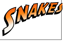
Using an Image
So that leaves us with the only sensible decision. An old-school pre-generated image.
I built mine using Inkscape, an open source vector graphic illustation program. This allows me to save the source as an .svg but render it (correctly) to a bitmapped .PNG usable, with 100% consistency, across all browsers.

Summary
The excitement over the new features in HTML5 and CSS3 is real, but many pieces are not ready for prime time, particularly advanced font styles. We are certainly a long way from being able to render with just markup and a stylesheet.
SVG has been with us for quite a long time, but has not seen much popular usage. Partly because IE always used to require a plugin (its now native in IE9+), but also partly because of the inconsistencies in the rendered output across browsers.
These browser inconsistencies will continue in a CSS3 world, so I’m sure we will still be using photoshop, illustrator or inkscape to create images for a long time to come.