
CSS @media queries
Sat, May 21, 2011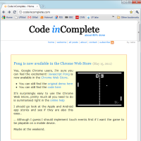
I spent a little time this week playing around with CSS @media queries, for both the pong demo I published earlier, and for this website itself. I was pleasantly surprised to find out that it was both easy and useful.
The basic idea is quite simple. You provide different CSS styles based on some property of the device that is viewing your site.
You can switch based on a number of device properties, but by far the most common will be the screen width, which you
can specify as a range using min-width & max-width.
In its simplest form:
#sidebar { display: block; }    /* sidebar is normally visible */

@media screen and (max-width: 400px) {
  #sidebar { display: none; }   /* hide sidebar if screen < 400px */
}
Other device properties you can base your @media queries on include:
- aspect-ratio
- orientation
- resolution (dpi)
Large Screen
For this website, I have a very plain header and all the navigation links are in sections within the sidebar, as seen here:
Small Screen
For smaller screens, particularly mobile devices, I wanted to hide the sidebar and show a simpler set of links in the header instead:
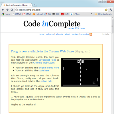
If you are reading this on a resizable browser you can see this in action by, errr, resizing your browser. When you resize small enough the sidebar and logo will no longer be shown and some header navigation links will appear instead.
CSS @media queries work by specifying default layout properties first, then overriding them for specific device properties, in this case screen widths:
@media screen {

  body {
    min-width: 45em;   /*               enough for #main            */
    max-width: 60em;   /* "sweet spot", enough for #main + #sidebar */
    margin:    0 auto; /* center align when > 60em                  */
  }

  #header .title { display: inline-block;        }
  #header .logo  { display: block; float: right; }
  #header .links { display: none;                } /* only displayed on small screens */

  #main {
    width:        45em;
    margin-right: 15em;
  }

  #sidebar {
    display:    block;
    float:      right;
    width:      15em;
  }
}

@media screen and (max-width: 60em) {       /* when screen is smaller than our 'sweet spot' of 60em we ... */
  #main          { margin: 0 auto; }        /* ... remove right-margin and center align #main              */
  #sidebar       { display: none;  }        /* ... hide the sidebar                                        */
  #header .logo  { display: none;  }        /* ... hide the logo                                           */
  #header .links { display: inline-block; } /* ... show the simpler header navigation links                */
}
NOTE: this is a simplified example. I actually use sass as my css templating language and minify CSS using YUI Compressor, so if you view-source on this page you will see somewhat different results.
Pong
I did a similar thing to scale the game court and hide the sidebar in my pong demo By specifying widths in increasing order we only need to specify the style overrides if they are different (e.g. we don’t need to ensure the sidebar has display in every @media query):
#sidebar { width: 18em; height: 40em; float: left; }

@media screen and (min-width: 0px) {
  #sidebar { display: none; }
  #game    { display: block; width: 480px; height: 360px; margin: 0 auto; }
}

@media screen and (min-width: 800px) {
  #game    { width: 640px; height: 480px; }
}

@media screen and (min-width: 1000px) {
  #sidebar { display: block;    }
  #game    { margin-left: 18em; }
}

@media screen and (min-width: 1200px) {
  #game    { width: 800px; height: 600px; }
}

@media screen and (min-width: 1600px) {
  #game    { width: 1024px; height: 768px; }
}
Sass
Using @media queries with sass is a piece of cake, if you are using the scss syntax (which I highly recommend) you can use traditional @media query syntax and simply embed your scss inside a @media block.
You can also flip this around and nest your @media blocks inside scss blocks and sass will take care of bubbling it up to the top level of the stylesheet ready for your browser.
- find out more here
Conclusion
One key to using @media queries is to keep a strict separation of your layout properties from your style properties. You want to be able to easily see the layout structure of your site for different device sizes without the clutter of other styles such as colors, borders and backgrounds.
The main downside I can see is that the changes you can make are somewhat cosmetic. If you want to make a serious structural change, you need to either use javascript, or rely on very modern CSS modules that allow structural changes with pure CSS such as grid positioning
For example, to get the effect I wanted where the links “move” from the sidebar to the header, I had to duplicate my navigation links, once in the header and again in the sidebar, I then use @media queries to simply toggle which one is visible and which one is hidden. This is not only a duplication of code server side when generating the page, its a duplication of content client side which, if not trivial, can affect your page weight and your performance.
I expect that there are some DOM events fired when different @media blocks are applied that could be used to allow javascript code to make more structural changes if it needs, perhaps via ajax calls to get content only when needed.
One other minor point to also note, if you compress your CSS using YUI Compressor be aware that older versions broke @media queries. This can be fixed by using the latest version of the compressor. You can find out more here
Links
- Media Queries Spec
- A List Apart - Responsive Web Design
- Sitepoint - Media Queries
- IEBlog - CSS3 Media Queries
- Script Junkie - Respond to Different Devices with CSS3 Media Queries
- SASS and CSS media queries
- YUI compressor and CSS media queries